

4 Things to Look Out for when Customizing your CodePen Profile


Overview
I have always loved CodePen. Ever since I wrote my first line of code, the CodePen platform has given me the ability to share my work and grow. What I like the most about CodePen is the feature to customize your profile.
While exploring and trying out different ideas with my profile, I noticed a few things that surprised me at first. Hence, in this article, I will be sharing my findings to help you customize your CodePen profile.
Disclaimer: I have been playing around with my profile CSS for ~14 months, and this blog post is entirely based on my personal research. Make sure to check out CodePen's official blog post regarding this topic.
Target elements with Type selectors, Attribute selectors, and ID selectors
Some specific class names seem to change when CodePen updates are rolled out on the user level. As I was using classes this whole time, my design began to break when new updates came in. This is why I think we should select elements using the DOM structure, type selectors, ID selectors, or attributes selectors ([data-*]) whenever possible.
Let me clear my observation with a few examples.
Example 1: Highlighting my featured pen
In the third iteration of profile customization, I remember adding a greenish border to highlight my featured pen. It was done with the following line of code:
.profile-grid-pens .featured-pen .thumbnail-wrap{
    box-shadow: 0 0 0 3px #47cf73;
}
Then suddenly, without any warning, it stopped working. I couldn't figure out why it broke until I noticed a significant change in the DOM structure.
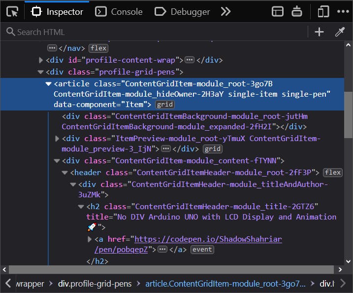
The problem
As far as I can understand, the first item in the .profile-grid-pens is supposed to be the featured pen. But after the August update, it is the same element without a .featured-pen class. Consequently, the CSS rule didn't work.
How do we fix it?
When we closely look at the DOM structure, we see that the first <article> is the direct child of .profile-grid-pens with data-component="Item".
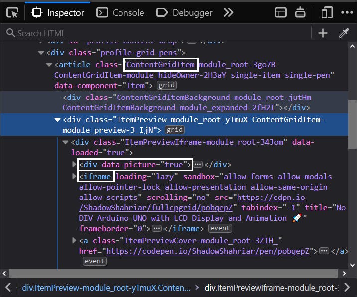
In addition to that, the second direct child of <article> is the ItemPreview module which contains the thumbnails (div[data-picture="true"] > *) and the <iframe>. This is the element we want to apply our greenish border to.
Then, I settled with this piece of code:
.profile-grid-pens > article:first-of-type > div:nth-of-type(2) {
    box-shadow: 0 0 0 3px #47cf73;
}
I kept using .profile-grid-pens because I didn't found another way to specify its location 😓 (let me know if you can!). Elements with *-module-root-* classes tend to be updated frequently. It had none. So it was safe for me to assume the class name wouldn't change.
Example 2: Disabling live thumbnails in pen showcase
I had to deliberately turn off live previews in my profile showcase. Because all of my pens used way too much HTML that almost freezes the site. Can you imagine how much layout it costs to have ~500 <DIV>s in the viewport? 😬
Compared to my other pens, the featured one used no HTML. So it was okay to have a live preview.
So, with both situations considered, I came up with this code:
.profile-grid-pens .hide-owner:not(.featured-pen) .iframe-wrap > iframe {
    display: none;
}
For the same reasons mentioned in the first example, I replaced the former with the following:
.profile-grid-pens > .item-grid > article > div iframe {
    display: none !important;
}
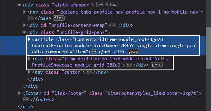
The featured pen is separated from the .item-grid in the most recent update. This is actually good as I didn't have to worry about excluding it.
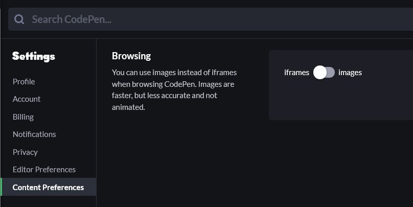
By the way, you can browse all profiles without live <iframe> previews, as mentioned in the documentation. Head over to Settings > Content Preferences > Browsing to do so.
Example 3: Properly capitalized brand names in the profile links section
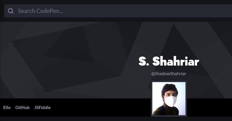
I remember I was fascinated seeing Ana Tudor's profile for the first time, and her profile-links section had caught my attention.

Because I loved it so much, I ended up writing the following:
.profile-links > a {
    position: relative;
    color: transparent !important;
    margin: 0 -8px;
    font-weight: bold;
}

.profile-links > a::after {
    content: "";
    position: absolute;
    left: 0;
    top: 0;
    width: 100%;
    display: block;
    color: #9b9dad;
    text-align: center;
}

.profile-links > a:hover::after {
    color: #fff;
}

.profile-links > a[href^="https://ello.co/shadowshahriar"]::after {
    content: "Ello";
}

.profile-links > a[href^="https://github.com/ShadowShahriar"]::after {
    content: "GitHub";
}

.profile-links > a[href^="https://jsfiddle.net/user/ShadowShahriar/fiddles"]::after {
    content: "JSFiddle";
}
Which gave me the following:
But when I was in the middle of refactoring the code, I realized this could be done better by selecting #profile-links instead of .profile-links. I have two reasons for that:
"A rule of thumb might be to use ID's to identify large sections of your page, or important items and classes to attach styles to the other things."
"Using
!important, however, is bad practice and should be avoided because it makes debugging more difficult by breaking the natural cascading in your stylesheets."
And the refactored code looked like this:
#profile-links > a:not(.button) {
    position: relative;
    margin: 0 -5px;
}

#profile-links > a:not(.button),
#profile-links > a:not(.button):hover {
    color: transparent;
}

#profile-links > a:not(.button)::after {
    position: absolute;
    left: 0;
    top: 0;
    width: 100%;
    height: 100%;
    display: block;
    font-weight: bold;
    text-align: center;
    color: #9b9dad;
}

#profile-links > a:not(.button):hover:after {
    color: #fff;
}
There are more cases where we should use ID selectors, type selectors, or attribute selectors instead of class selectors. Because they are more specific than class selectors, we can save ourselves from using the !important rule.
You can use CSS Preprocessors
Before November 2020, I remember using CSS custom properties to keep my styles organized. It worked like a charm!
:root {
    --color-scheme: rgb(0, 100, 200);
    --selection-background: rgba(255, 255, 255, 0.1);
    --selection-color: #fff;
    --username-font-weight: bold;
    --display-name-font-size: 130%;
    /* ... some more variables ... */
}

.profile-name-wrapper {
    font-size: var(--display-name-font-size);
}

/* ... more rules ... */

::selection {
    background-color: var(--selection-background);
    color: var(--selection-color);
}

/* ... some more rules ... */
However, it is no longer likely to work after the November 2020 update. These CSS variables get stripped out in the final code. I noticed it on 23rd November and removed my profile CSS as a whole. After that, I began to customize my profile without CSS custom properties. Soon updating and maintaining became a daunting task 😓
It wasn't until the last month that I started using a preprocessor instead of writing pure CSS. I headed over to Settings > CSS > CSS Preprocessor and choose SCSS. I picked SCSS as its syntax is identical to CSS and it's blessed with Sass variables. I could just replace the former with this:
$color-scheme: rgb(0, 100, 200);
$selection-background: rgba(255, 255, 255, 0.1);
$selection-color: #fff;
// ... more variables ...

// ...

::selection {
    background-color: $selection-background;
    color: $selection-color;
}

// ...
Remember this piece of code from our third example? Can this be improved somehow? 🤔
.profile-links > a[href^="https://ello.co/shadowshahriar"]::after {
    content: "Ello";
}

.profile-links > a[href^="https://github.com/ShadowShahriar"]::after {
    content: "GitHub";
}

.profile-links > a[href^="https://jsfiddle.net/user/ShadowShahriar/fiddles"]::after {
    content: "JSFiddle";
}
Yes. Sass Maps are here to the rescue!
@use "sass:map";

$profile-link-sites: ("Ello", "GitHub", "JSFiddle");
$index: 0;
@each $site-name in $profile-link-sites {
    $index: $index + 1;
    #profile-links > a:nth-child(#{$index})::after {
        content: $site-name;
    }
}
It is worth noting that, in the former code, I was selecting links based on their href value. But if I know their order, I can put the site names into a map and iterate through it.
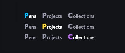
By using the same logic, I applied a different color to my pens-projects-collections tabs:
@use "sass:map";

// * === makes the first letter bigger
.profile-nav-1 .explore-tab::first-letter {
    font-family: $profile-fonts;
    font-size: 1.5em;
    padding-right: 1px;
}

// * === colorizes the tabs' first letter
$explore-tab-colors: (#0ebeff, #ffdd40, #ae63e4);
$index-tab: 0;
@each $color in $explore-tab-colors {
    $index-tab: $index-tab + 1;
    .profile-nav-1 .explore-tab.active:nth-child(#{$index-tab})::first-letter {
        color: $color;
    }
}
Job well done!
Some CSS properties will be Stripped Out
As mentioned in the previous section, CSS custom properties get stripped out. Additionally, some at-rules and CSS properties will be also eliminated in the final profile CSS. Here is a list of those properties I have found so far:
@font-faceat-rule@importat-rule- Scroll Snap module
- scrollbar-width and scrollbar-color
- mix-blend-mode
- -webkit-text-fill-color
- -webkit-text-stroke
- inset
- background-blend-mode
- content-visibility
- backdrop-filter
- place-items and place-content
- gap (grid-gap)
- mask and its longhand properties (
mask-*) - Inline SVG data-uri in
background-image. For example:element { background-image: url('data:image/svg+xml; ... '); }
Why should we bother?
One wouldn't be bothered about it until they do something fancy with their profile.
I stumbled upon it when trying to achieve an outlined text for my display name, and the styles didn't show up. Then I began to test with other properties, most notably the backdrop-filter. To have a glass-like header.
I also wanted to have a typeface of my choice. So I thought of using a @import rule. It didn't work either. I was able to have custom scrollbars with the ::-webkit-scrollbar pseudo-class, but scrollbar-width and scrollbar-color were stripped out. As a consequence, it was unlikely to have custom scrollbars in Firefox.
Other properties were tested for the sake of completeness.
Why these CSS properties gets stripped out anyway?
It's hard to tell why these properties are eliminated. I didn't notice an official statement that would describe it yet. But two possible reasons pop into my mind.
To avoid conflict between profile CSS and the design system
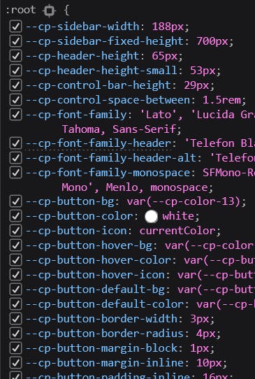
Except for the scoped ones, all :root variables are prefixed with --cp-. One could actually edit these to customize their profile.
Our customized CSS variables will override these. Changing one of those can modify the dependent ones too. You might offer a terrible user experience in your profile if you don't use these with caution. Stripping out custom properties ensure that it never happens.
To keep the profile accessible and backwards compatible
Some CSS properties (like content-visibility, backdrop-filter, mask) are new and have little to no browser support. This can cause design inconsistency.
Properties like scrollbar-width and scrollbar-color are only supported in Firefox 64 and higher.
Properties like -webkit-text-fill-color and -webkit-text-stroke are non-standard and should not be used without careful consideration.
gap (grid-gap), place-items, place-content, and other Grid layout CSS properties can effectively change the profile layout. It, in turn, can create confusion.
Third-party
@imports can slow down the first contentful paint and affect SEO.
Some observations
While
place-itemsandplace-contentget stripped out,align-itemsandalign-selfworks just fine.We can't place a inline SVG data-uri in
background-imagebut we can link to a SVG image like below:element { background-image: url('https://mysite.com/assets/bg.svg'); }
Make sure your profile remains Accessible
It might sound a cliché to most of you, but accessibility should be the foremost concern for every good design. Hardly accessible profiles are way more common than you may think. Not until I visited a handful of custom profiles did I realize it was that bad.
I am no professional in UX development yet, but here are the most common issues I have found in those profiles -
- Not having enough contrast between text and background.
- Using eye sensitive colors (like pure red or yellowish-green) in a wide layout or sometimes in the
<body>. - Using thinner
font-weights. - Not respecting the user preference of
prefers-reduced-motionmedia at-rule. - Having too much motion or animations.
Don't do these, please.
Obviously, there are no rules written in stone to customize your profile. You can do it however you like but with accessibility in mind. Doing art is to know when you are done.
Bonus: Customize your profile using DevTools
Do you know the best part of customization? It is the visual feedback.
Unfortunately, you don't get to see a live preview on CodePen while customizing your profile.
"This little trick doesn’t work anymore because of a security precaution we put in place preventing some URL’s on CodePen from being
<iframe>d."
Here is a workaround.
- In Firefox, open the Style Editor by pressing
Shift+F7, - Create a new inline stylesheet by clicking the
+button. Then you can start selecting elements and writing CSS rules for them. You can see the changes as you code.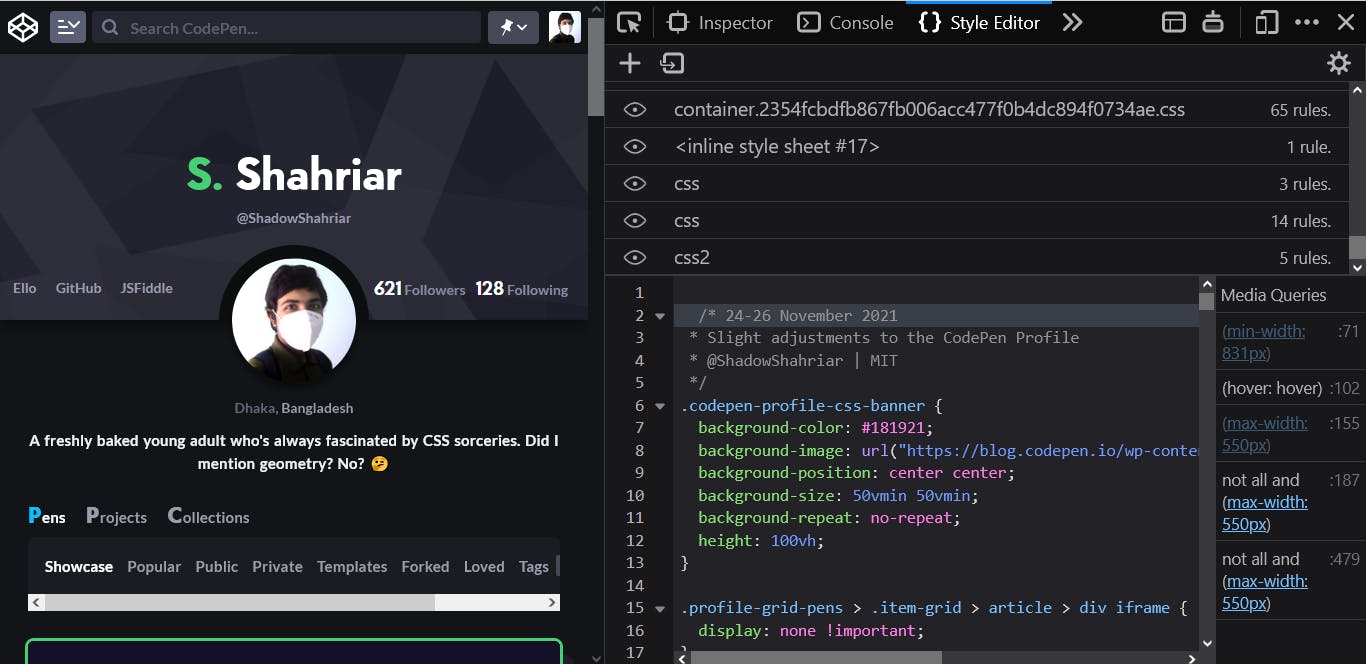
- Having done this, you put the code into your profile CSS and save the pen.
There are multiple ways to do the same in Chrome. Harry summed those in the Stack Overflow answer a few years ago.
Final Thoughts
I hope I was able to show you some of the interesting aspects of customizing your CodePen profile. If you haven't already, you are very welcome to use my profile CSS starter.
The sweet folks on CodePen are trying their best to constantly improve it as a platform for front-end developers. Chances are, the things I mentioned in this article will become obsolete over time. But I am glad to write about CodePen in my first blog post.
I have tried to keep the information as precise as possible in the article, yet there might be some mistakes. If you have spotted any or think something could be improved, kindly let me know. I am always eager to hear and learn from you.
That's from me for this week. See you soon in a future post 😄
Cover Photo by Kelly Sikkema on Unsplash